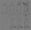
I am not happy with this because it looks more polished than I wanted. I was just trying to design an outfit, but then I had no idea about the colours. So I tried choosing colours, but couldn't visualise it well without lighting. So I thought I'd try making it like a concept piece. I added lighting, and my brushwork was atrocious, since I have trouble with brushwork. Even though I'm using bigger brushes at higher opacities than I used to, I'm still having to repeatedly paint over areas to make it more "chunky" and defined with the right shapes as opposed to "splotchy" and messy. I tried very hard to think in terms of paint-by-number instead of constant blending, and I still don't think I'm doing it right. I'd like to get the earlier stages of a piece to read better.
Yuck: She's kind of a slumpy girl. I used a mirror and thought a lot about the underlying anatomy, but my attempts at it still made her look unnatural.
Yay: I learned a lot about leather boots, pants, and various facial expressions.
Calendar

|
May '26 |
|
||||
|---|---|---|---|---|---|---|
| Mo | Tu | We | Th | Fr | Sa | Su |
| Thursday, May 14. 2026 | ||||||
| 1 | 2 | 3 | ||||
| 4 | 5 | 6 | 7 | 8 | 9 | 10 |
| 11 | 12 | 13 | 14 | 15 | 16 | 17 |
| 18 | 19 | 20 | 21 | 22 | 23 | 24 |
| 25 | 26 | 27 | 28 | 29 | 30 | 31 |


